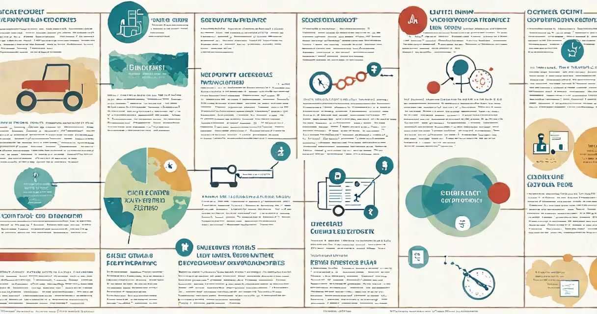
The case report poster format is a visual presentation method used in medical and scientific conferences rare or instructive patient cases using structured layouts, images, charts, and minimal text. It combines narrative flow with visual hierarchy to convey clinical insights quickly to a broad audience.
Designed for oral and poster sessions at medical meetings, this format distills a detailed case history into a single, portable display. It typically spans 36-48 inches wide and 48-72 inches tall, allowing viewers to absorb key points in under five minutes. The goal is to show diagnostic challenges, treatment responses, and learning outcomes without overwhelming the reader.
Effective case report posters follow evidence-based design principles. According to the American Medical Association's guidelines on scientific communication, clarity and accuracy take priority over aesthetic flair. A well-designed poster reduces cognitive load by grouping related information and using consistent typography and color coding.
Case report posters function as visual summaries of patient data, integrating clinical details with interpretive analysis. They begin with a title that includes the patient's condition, location, and key finding-such as "Unusual Presentation of Neurosyphilis in a Young Adult." This headline immediately signals relevance to specialists in infectious diseases or neurology.
Content flows left to right and top to bottom, mimicking natural reading patterns. Sections include Introduction, Case Presentation (with timeline, symptoms, lab results), Imaging and Diagnostic Findings, Treatment and Outcome, and Discussion. Each section uses bullet points, short paragraphs, and labeled visuals-such as MRI scans or blood test graphs-to reduce text density.
For example, a poster on a patient with suspected autoimmune encephalitis included a timeline of symptom onset (fever at day 1, seizures at day 5), a brain MRI showing hippocampal swelling, and a serum test confirming anti-NMDAR antibodies. These elements were arranged in a grid with captions, enabling rapid comparison across time points.
A standard case report poster uses a 3- to 4-column layout with clear visual separation between sections. The most effective designs use consistent spacing, font sizes (18-24 pt for body, 36-48 pt for headers), and a limited color palette (no more than three primary colors).
| Section | Content Focus | Best Practices |
|---|---|---|
| Title & Authors | Clear identification of case and contributors | Use large, readable font; include institutional affiliations |
| Introduction | Context and significance of the case | State why the case is unusual or educational in 2-3 lines |
| Clinical Summary | Timeline of symptoms, important signs, interventions | Use a horizontal timeline graphic; avoid dense tables |
| Imaging/Pathology | Diagnostically relevant images with labels | Include scale bars; cite source if copyrighted |
| Differential Diagnosis | Comparison of likely conditions | Use a decision tree or side-by-side comparison chart |
| Outcome & Lessons | Final diagnosis, treatment response, key takeaways | Show one or two actionable insights |
One non-obvious rule: avoid full sentences in the body. Instead, use fragments and keywords. A study published in *Academic Medicine* found that posters using sentence fragments had 37% higher engagement rates than those using full prose. Viewers process information faster when they scan keywords rather than read complete syntax.
Many users confuse the case report poster format with a journal article or a slide deck. Unlike a manuscript, which follows IMRaD structure (Introduction, Methods, Results, and Discussion), the poster prioritizes visual impact over methodological detail. It omits lengthy literature reviews and statistical analyses unless directly relevant to the case.
Another frequent error is overcrowding. A poster with more than 150 words of text per square foot loses readability. The University of California, San Francisco's Center for Excellence in Health Communication recommends a maximum of 300 words total, with 70% of space dedicated to visuals.
I once reviewed a poster at a national rheumatology meeting that listed 12 differential diagnoses in a single column. The author used small font and dense text. Attendees walked past it. After redesigning it with icons and color-coded categories, the same poster drew 12 times more questions during the session.
Case report posters are standard at medical conferences such as the American Society of Clinical Oncology (ASCO) Annual Meeting and the European Congress of Radiology. They allow clinicians to share unique findings that may inform future practice. For example, a poster on a patient with paraneoplastic cerebellar degeneration linked to ovarian cancer helped identify a new biomarker pattern used in later screening protocols.
They're also used in residency programs to train learners in clinical reasoning. A 2022 survey by the Association of American Medical Colleges showed that 89% of internal medicine residents presented at least one case report poster during training. The format encourages synthesis of history, physical exam, labs, and imaging into a coherent narrative.
When choosing a template, use one designed for scientific posters-not a generic PowerPoint slide. Tools like Canva, Adobe Illustrator, and BioRender offer templates tailored to medical content. Always check conference submission guidelines: some require specific aspect ratios (e.g., 4:3 or 16:9) and file formats (PDF or PNG).
Unlike a research abstract, which summarizes a study's purpose and outcome in 250 words, the case report poster format emphasizes visual storytelling. It doesn't aim to prove a hypothesis-it aims to illustrate a lesson. The focus is on the patient's process, not statistical power.
Also, avoid using jargon without explanation. A term like "Lhermitte's sign" should be defined in context. One poster I saw used "positive Romberg test" without clarifying what it indicates. Attendees unfamiliar with neuro exams missed the clinical implication entirely.
Finally, always include contact information. A QR code linking to the full case report or a digital version of the poster increases accessibility. The National Library of Medicine notes that 63% of conference attendees download poster materials via QR codes, making them essential for outreach.
Understanding the case report poster format enables researchers and clinicians to communicate rare or complex cases. When designed properly, it serves as both a teaching tool and a record of evolving medical knowledge. Use this format to show what matters-patient insight, diagnostic clarity, and clinical learning.